


The Colours of Chelsea Flower Show 2026
How is it that a truly beautiful garden can instantly calm, restore, or quietly uplift us? There is something rather remarkable about the way outdoor spaces have the power to soothe the mind, stir emotion, and bring people together through a shared appreciation of beauty and nature.
This year at Chelsea Flower Show, there has been a particularly thoughtful focus on the restorative qualities of planting and colour. The palettes may feel softer and more muted than in previous years, yet they are no less captivating for it. Gentle layers of greens, creams, and dusky tones create spaces that feel deeply harmonious, while occasional bursts of brighter colour bring moments of joy and energy exactly where they are needed most.
In the hope of bringing a little of that Chelsea inspiration back into our own gardens, we’ve gathered together some of the show’s most memorable colour palettes and planting combinations - ideas to return to, take note of, and perhaps even recreate in your own outdoor spaces over the seasons to come.
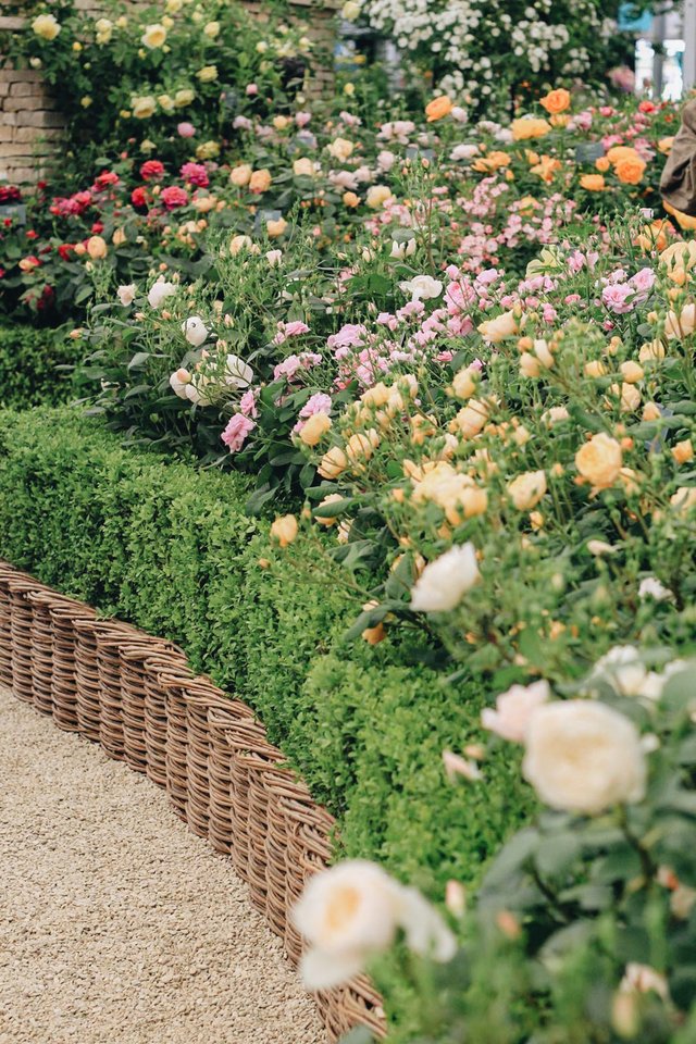
The Cotswold Garden at David Austin Roses

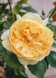
Calm, Harmonious Tones
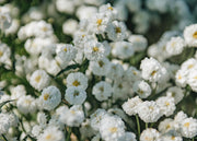
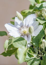
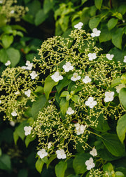
The thoughtful layering of gentle, understated planting was a theme woven beautifully throughout many of this year’s Chelsea gardens. In her ‘On The Edge Garden’, Sarah Eberle used delicate white blooms and pale stone to echo the fragility and quiet beauty of Britain’s wild, untamed landscapes, while Baz Grainger’s ‘Killik & Co Garden’ embraced soft creams and muted tones to create a space that felt grounding, restorative, and deeply calm.
From the elegant spires of Digitalis ‘Dalmatian White’ to the pollinator-friendly pom-poms of Leucanthemum × superbum ‘Luna’, there are countless ways to recreate this softer style of planting at home. Whether planted in generous drifts for impact or woven gently amongst richer colours, these quieter tones bring a sense of balance and atmosphere to the garden.
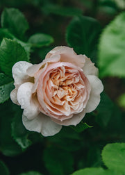
And, of course, no romantic planting palette feels quite complete without the timeless beauty of roses. Whether you are drawn to the apricot blush of the new ‘Sir David Beckham’ rose or the softly peach-tinted blooms of Rosa Desdemona from David Austin Roses, they capture the enduring spirit of an English garden at its most enchanting.
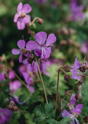
Creams, pastel pinks, soft yellows and whites


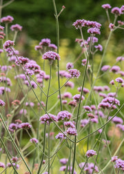
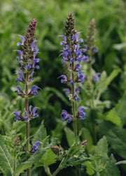
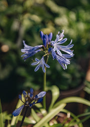
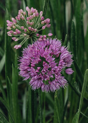
Violets, Purples and Blues
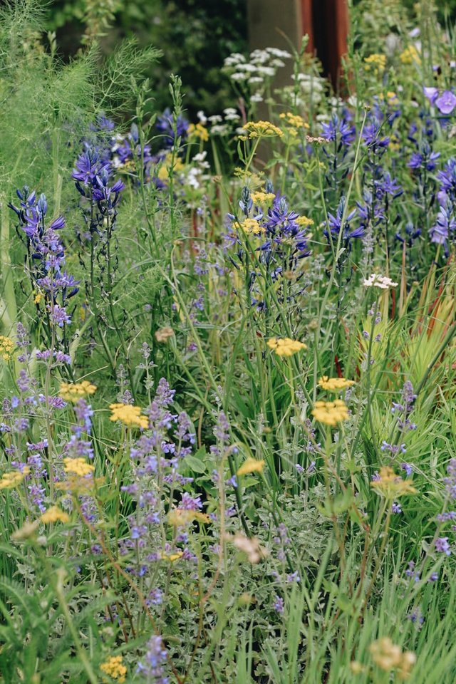
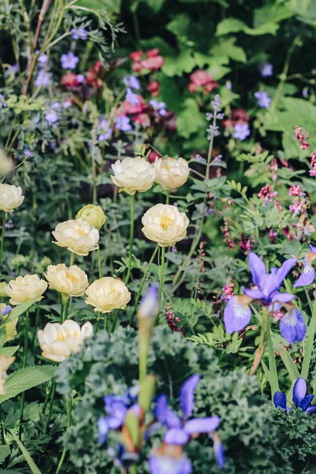
Whether you’re hoping to draw the eye or create a more naturalistic style of planting, the presence of violet, purple, and soft blue tones throughout the garden instantly evokes the spirit of Chelsea Flower Show.
Seen woven through many of this year’s gardens, and long adored within cottage garden planting schemes, this quietly powerful palette is surprisingly easy to recreate with just a handful of thoughtfully chosen plants. The elegant height of Iris sibirica ‘Tropic Night’ echoes the serene atmosphere found within ‘The Children’s Society Garden', while the soft haze of Nepeta × faassenii ‘Kitten Around’ brings the movement, texture, and pollinator-friendly planting celebrated in Arit Anderson’s ‘Parkinson’s UK Garden’.
Layered amongst foliage and softer shrubs, these perennial tones create gardens that feel calm, harmonious, and gently uplifting - alive with movement, colour, and the welcome presence of bees and butterflies.
Baz Grainger's Killik & Co 'A Seed in Time' Garden, Chelsea Flower Show 2026
Darren Hawkes Lady Garden Foundation 'Silent No More' Garden, Chelsea Flower Show 2026
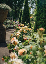
Golden, Bronze and Rust Colours
Whilst this palette may feel a little unexpected within the traditional British garden - Max Parker-Smith’s garden, after all, drew inspiration from the vast and sunlit landscapes of the Australian outback - there is something wonderfully uplifting about these warmer tones and the sense of vitality they bring to outdoor spaces.
Tom Stuart-Smith’s ‘Tate Britain Garden’ was particularly captivating in its use of vibrant planting and richly layered colour, creating a feeling of ecological abundance and beautifully natural contrast. These warmer yellows, bronzes, and golden hues also have a remarkable ability to enhance the surrounding planting, drawing out the richness and texture of softer greens and deeper tones nearby.
And perhaps that was one of Chelsea’s quiet lessons this year: that brighter colours feel all the more striking when used thoughtfully and with restraint. Balanced with bronze foliage and softer golden planting, these sunshine shades bring warmth, energy, and moments of joyful contrast to the garden.
Strong yellows, bronzed oranges and rust planting


More gardening inspiration


Glossary